Migrating my Jekyll theme to Minimal Mistakes
What I learned about Jekyll themes
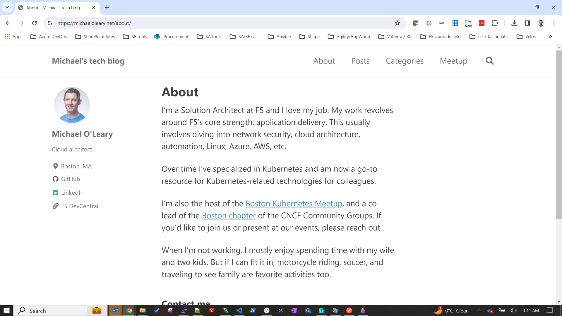
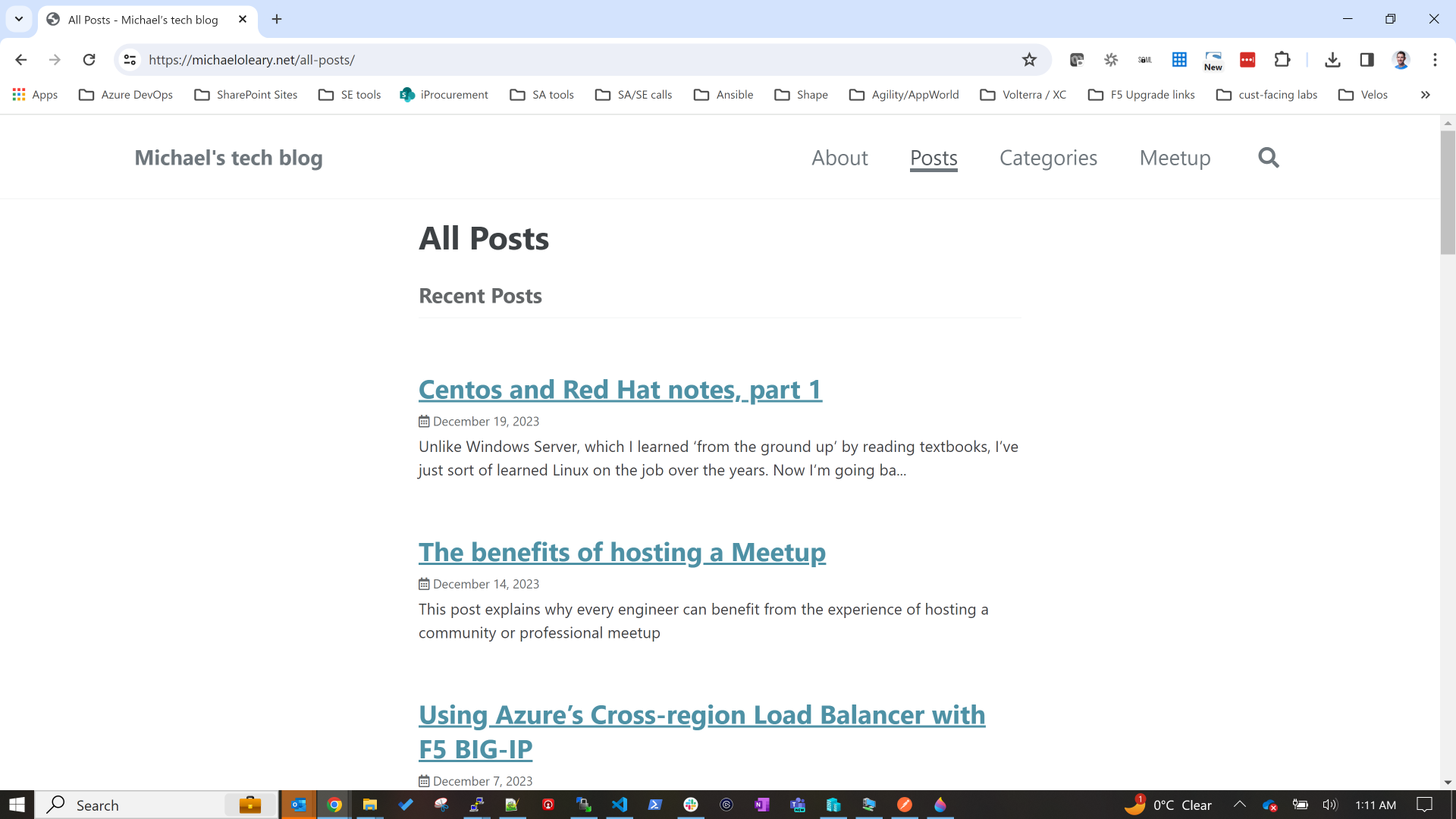
I recently migrated from the default theme in Jekyll, called Minima, to a new theme, called Minimal Mistakes. Most of what I did was done “on-the-fly” because this site is not a production-grade website, but I thought to make a few notes here.
Old theme (Minima)
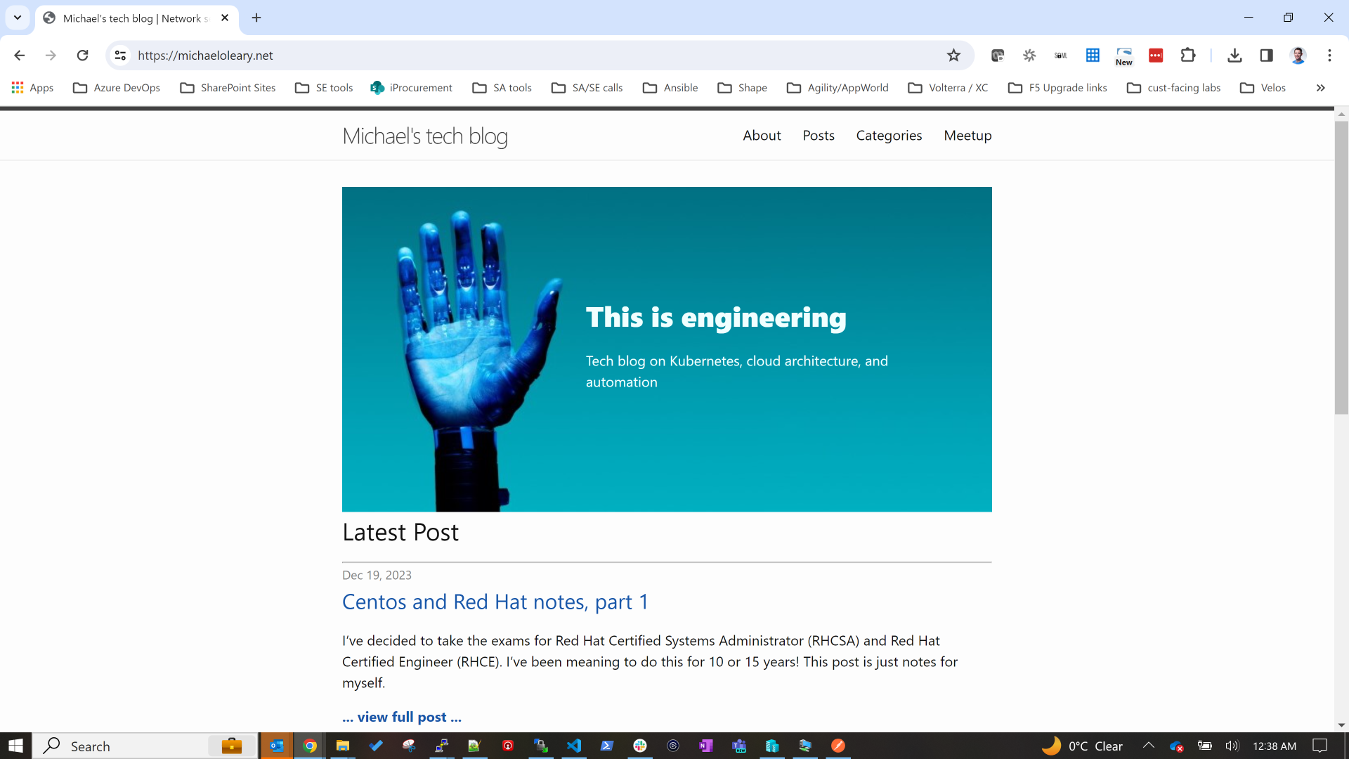
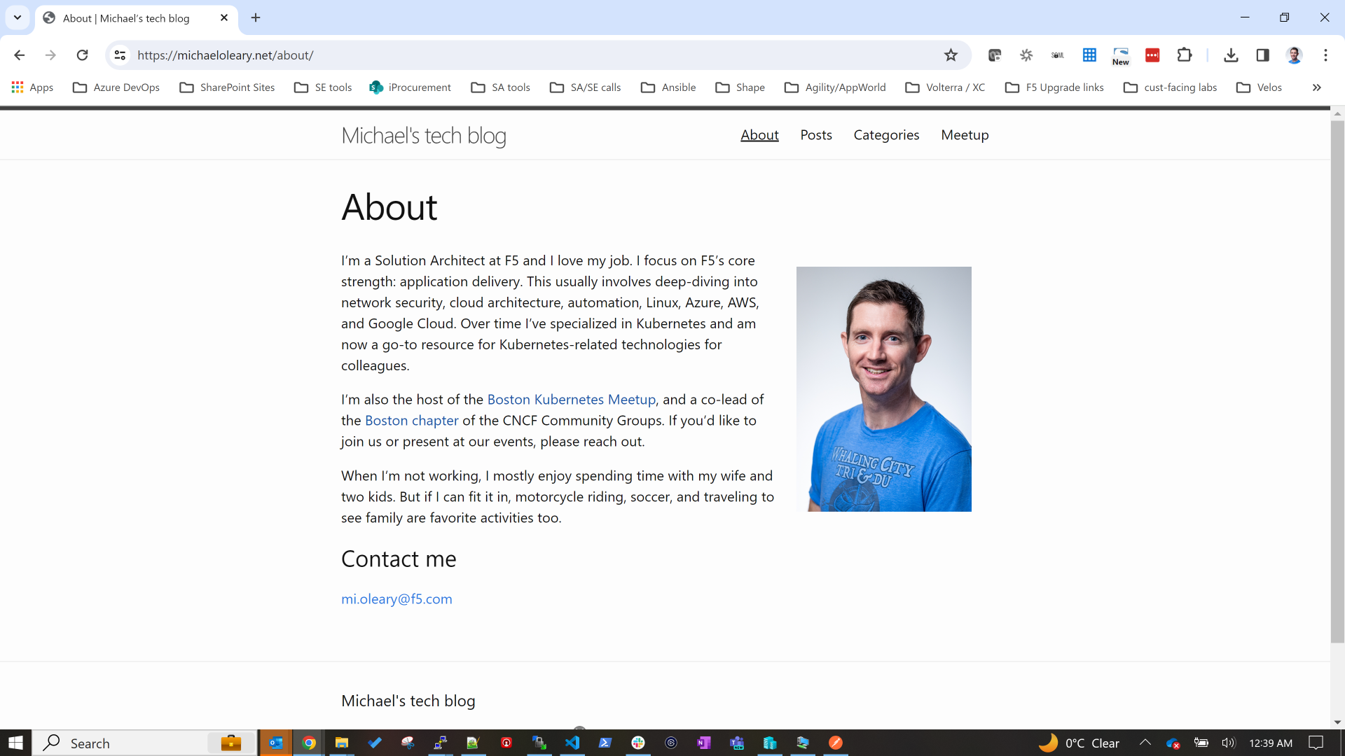
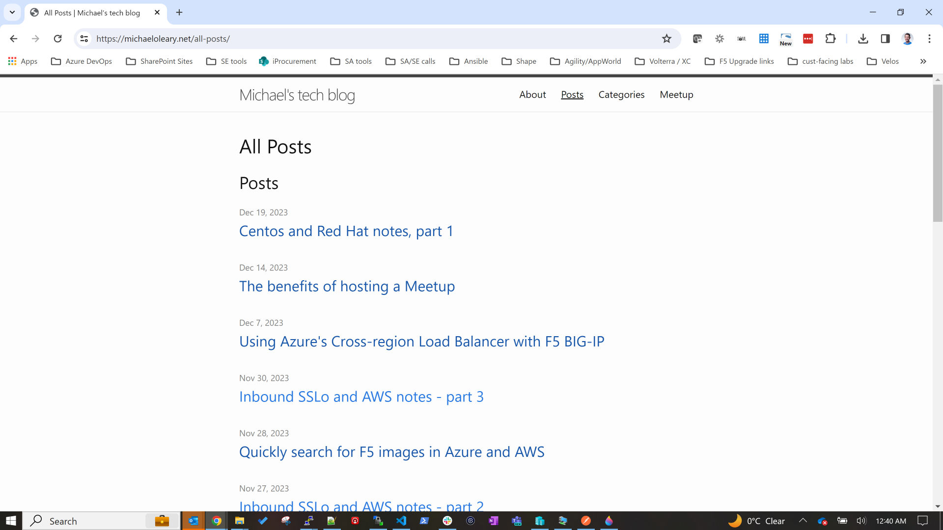
New theme (Minimal Mistakes)
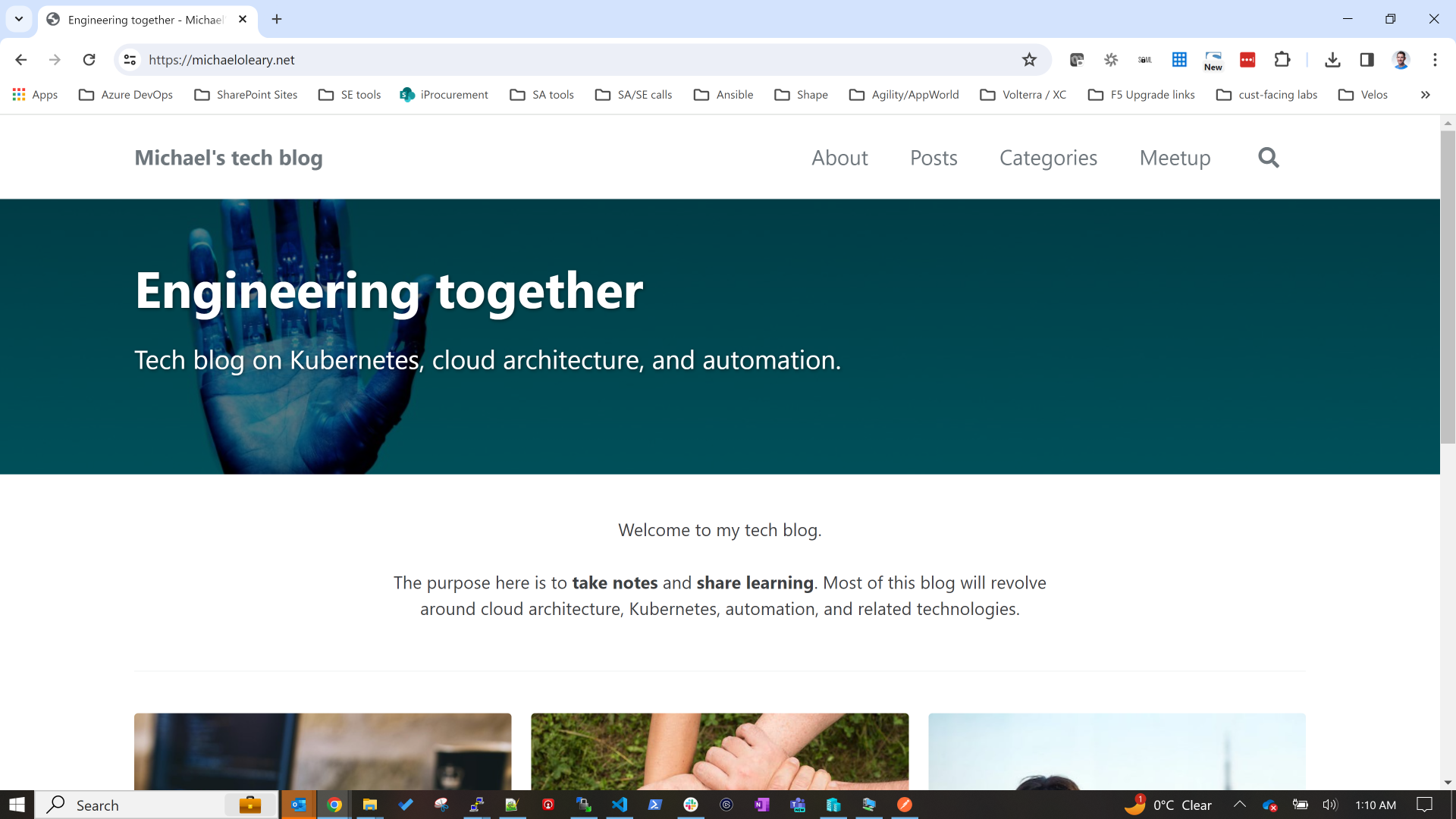
Why change themes?
I knew that the default theme gave me very minimal features. I had customized a few theme files and moved them from the gem-based location on my laptop into the project itself. I briefly documented this in an earlier post.
In that post I made notes about future plans I had, both in terms of blog features I was looking for as well as the look and feel of the site. As it turns out, switching themese achieved both of these broad goals for me.
The new theme has great examples and nice features (tags, short descriptions, social media sharing, multi-author support, built-in menu functionality, just to name those that I implemented immediately). But it also allows me to edit the look and feel that are major improvements without needing to dig through HTML, or CSS, or includes files.
Why choose Minimal Mistakes?
I was browsing for themes and came across this great site. As you can see, the link to Minimal Mistakes showed that this theme was simple, extremely popular, and actively developed.
How did I update the theme?
I followed the steps outlined here.
I started by installing the gem-based theme locally because I was ignorant of the fact that I needed a remote theme to use GitHub pages. I soon backed out those changes and followed the instructions for a remote theme.
Before this switch, I wasn't aware that GitHub pages has only a few supported themes. If you want a theme that is not on this list, you need to use a remote theme. Read about supported and remote themes here.
Lastly I will note that if you read the instructions on installing Minimal Mistakes, you will see there is actually another option. You could copy all of the theme files into your project. That way you would not need a remote theme. I’ve never done that so I’ll consider it out of scope for this article.
What features am I now using in the new theme?
I started using a few new features immediately and I’ll continue to add more over time.
Navigation
After editing the Minima theme files to get a very basic navigation menu working, I now have an extremely easy method, outlined here. This boils down to a basic use of the _data folder in Jekyll. My navigation.yaml file is what makes this work.
Authors
I didn’t think about this originally, but once I saw how Made Mistakes supports highlighting the author of a post or page, I decided to use this on my About page. I considered using myself as the default author for every post, but when testing it felt like too much to see my own image and bio on every single post.
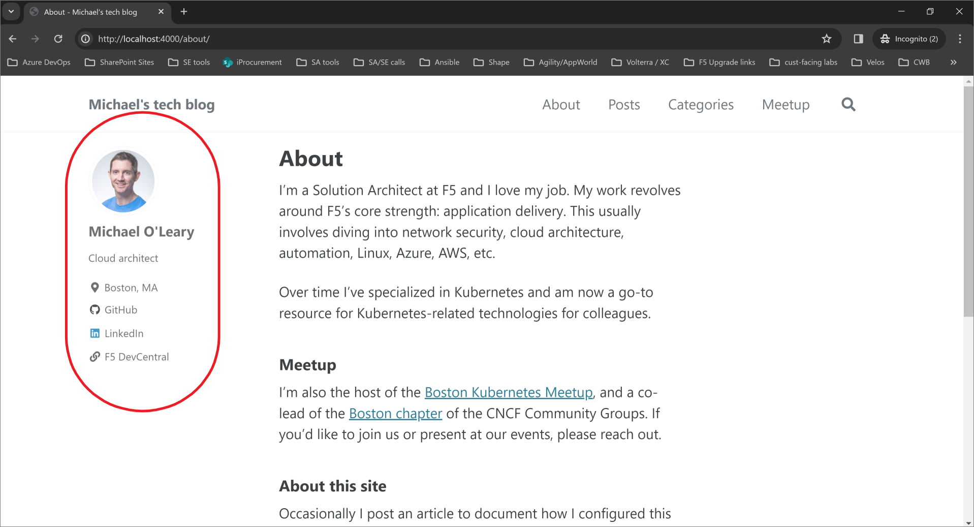
Table of Contents
The instructions for adding a ToC to a page or post are simple. All I need to do is add to my front matter:
1
toc: true
I have decided not to do this for every single post by default, but for some it’s handy. Check out the post with notes I made when learning Centos administration. I love this ToC on the right hand side.
Excerpts
I had an acceptable - if somewhat awkward - way to get custom excerpts for posts before migrating themes. But now it’s much easier. To start using excerpts I changed all existing posts with front matter that included description to instead call this field excerpts. The new theme uses this field in the same way I was using the description field: it’s a nice summary of a post to display in lists of posts. The SEO score should improve with this feature, too.
Galleries
The built-in gallery feature is perhaps my favorite UI improvement. I could never do this myself by manually tweaking HTML/CSS/Javascript. I simply don’t have the skills. But I’m using the gallery feature in this very post to show the old vs new website screenshots.
Splash page, header image, and feature row
One very nice UI feature is the splash page layout. I have used this layout for my index.markdown which is the home page of this site.

There’s a few nice things to see here.
- The header image can be laid out wide with text overlaid, optionally including links and image credits.
- There is also something called a “Feature Row” which is similar to a gallery, but unlike a gallery you are not meant to click on the image and see a larger version of that same image. It’s more intended for linking to sections of a site.
I found it fun to view the example page source and rendered page to find exactly how to make my own home page work.
Summary
I’ve learned a lot migrating Jekyll themes. My major takeaways:
- pick a theme early and stick to it
- GitHub pages does not allow many plugins. Use a remote theme. Keep it simple.
- Themese have many features. Keep it simple.
- None of this knowledge I’ve gained is useful to my corporate world. Be careful of time traps.
Thanks for reading.